Customization
Once you've gotten a basic layout done, you may be wondering how to customize the way things look, to suit your personal feel.
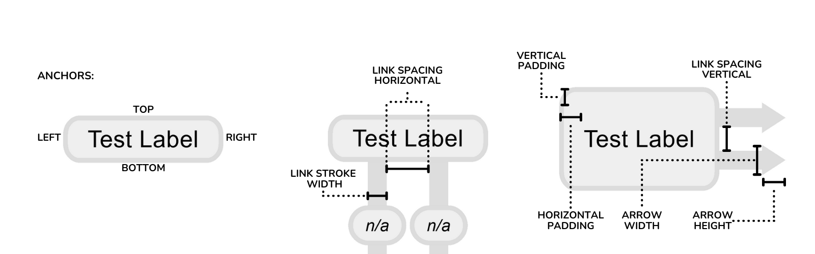
Common Terminology
The diagram below illustrates some of the basic terminology this plugin uses.
Panel Settings
There are three main panel settings:
- Background Color (
color): Use the picker to set whatever background you want (including transparent).- Newly added is the possibility for a background image, simply click the plus and enter a URL.
- Viewbox Width (
number): The width in pixels of the SVG viewbox. - Viewbox Height (
number): The height in pixels of the SVG viewbox.
By default, the panel's SVG will attempt to take up as much space both vertically and horizontally within the Grafana plugin panel as possible while still maintaining the viewbox aspect ratio.
You can also pan and zoom on the panel. Zooming works with just your mousewheel, and panning can be triggered by dragging the panels view using middle click or holding control while using left click.
Arranging Links
One of the most important parts of creating a weathermap is arranging the links between nodes. Depending on the orientation of these links, some specific settings may work best.
PLEASE NOTE: Links are drawn in the order in which they are added to a node, meaning some may overlap if you aren't careful when adding them. While a future version may make some easier way to deal with this, for now you can just remove the relevant links and re-add them in the necessary order.
Link Options
- Anchors:
- Each node has 5 anchors that any link side can connect to:
- (
Center | Top | Bottom | Left | Right)
- (
- This makes it easy to try and avoid having too many overlapping links. By default, links are auto-spaced to be as far apart as possible when parallel to each other vertically (attached to a
Bottomof one link, andTopof another). When parallel horiztonally (attached to aRightof one link, andLeftof another), nodes will automatically grow to accomodate them.
- Each node has 5 anchors that any link side can connect to:
- Label Offset # (
number): A number between 0 and 100 representing the location of the link's label as a percentage of that link's length. (Play around with it to see how it works! This is especially useful if you have close / overlapping links which need their labels to not overlap.) - See the link reference for other options.
Global Link Options
These options are set on all links.
- Base Color (
picker): The no-data color for links. - Spacing Horizontal (
number): A number in pixels, representing the spacing used between links when a node hasConstant Spacingset to true. - Spacing Vertical (
number): A number in pixels, representing the spacing used vertically between links, when a node hasCollapse Vertical Linksset to false (the default).
These options are for link labels (their current throughput):
- Background (
color): Label background color. - Border (
color): Label border color. - Font (
color): Label font color.
Node Options
Icon
- Select one of the icons from the existing library to attach it to a node.
- Width (
number): Icon bounding box width. - Height (
number): Icon bounding box height. - Padding, Horizontal & Vertical (
number,number): Padding between the icon's bounding box and node edges or text. - Draw Inside (
boolean): When true, will put the icon within the node's border (you may need to adjust the padding a little).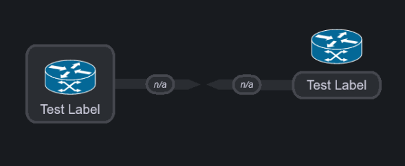
Padding
- Padding, Horizontal & Vertical (
number,number): represents the spacing between the text and the border.
Advanced
- In the
Advancedsection of theNodeseditor, there are three toggles: - Constant Spacing: Should links be a certain
Link Spacing Horizontal (px)apart?- This setting is useful if you have two nodes with signficant differences in text length, as by default the plugin will space links evenly across a
Top | Bottomanchor. Switching to a constant spacing forces these links to be the same pixel distance apart.
- This setting is useful if you have two nodes with signficant differences in text length, as by default the plugin will space links evenly across a
- Compact Vertical Links: Should nodes ignore the number of links attached to their sides?
- This setting lets you decide whether an individual node will grow when there is more than one link attached to either
Left | Rightanchor. When on, a node will always only be the size of its text and padding. When off, a node will grow so that links going left to right do not overlap (these links will beLink Spacing Vertical (px)apart).
- This setting lets you decide whether an individual node will grow when there is more than one link attached to either
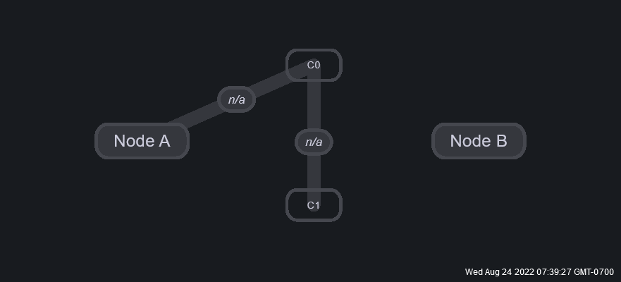
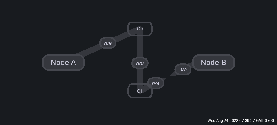
- Use As Connection (BETA): Should this node be used to extend another link?
- Link "turns/connections" are a beta feature added fairly recently. They work by turning nodes into invisible vertices through which links can be extended, and are especially useful if you want your links to all follow a specific path (i.e. to represent some physical organization or just for clarity).
- Link connections work like this:
- Have two nodes you want to connect with a link.
- Add however many nodes you need to represent all the vertices of your path, and toggle the "Use As Connection" button for each. This will now render the node as transparent, with a "C?" label letting you know it is a connection. It is recommended to simply delete connection nodes after converting them, instead of un-toggling this option if you want to use them for something else.
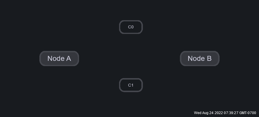
- In order, from the A-side to the Z-side, connect the first node to the last through these connections by creating new links. NOTE: Each connection node will only accept 2 links, one in and one out (i.e. you can not use a connection for multiple different links). This must be done from A-Z sides as each connection link will inherit the data from the A-side.
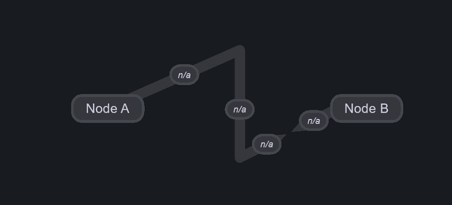
- When you have finished adding links from A-Z sides, you should see the A-side is extended and the Z-side remains connected to the final node in your path. Notice that when selecting connection nodes as sides for a link, query options dissappear (as they will be inherited from the A-side).
- When you exit edit mode, connection nodes will dissappear and your link will be drawn following their path! You can set the queries for each side of the extended link in the options for the links that touch either of your nodes (i.e. the first and last links of the connected path).
- Have two nodes you want to connect with a link.
Colors
- Background (
picker): Node background color. - Border (
picker): Node border color. - Font (
picker): Node font color.
See node reference for more options.
Font Options
- Node Font Size (
number): All nodes' font size. - Link Font Size (
number): All links' label font size.